


New research from Clear Channel uncovers the optimal creative elements for producing out of home posters to efficiently take advantage of audience’s attention.
As people’s exposure to advertising has dramatically increased, actual attention is said to be decreasing. But until now, what hasn’t been considered is whether an ad is using the attention it receives efficiently.
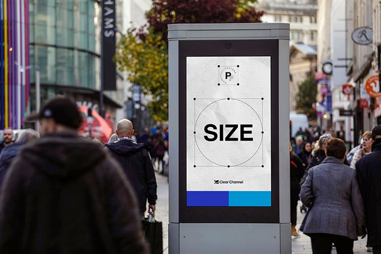
The research builds on the academic theory of fluent processing, uncovering that posters which are fluently processed use attention more efficiently. It taps into both perceptual fluency - testing optimal text and logo size - as well as conceptual fluency - understanding message complexity.
The study followed a two-stage research design. In the initial stage, respondents were placed in a lab environment and served real-world, real-brand, real-campaign poster stimuli from a distance. They were asked to adjust elements on the posters to preferred sizes for legibility and best aesthetic layout.
Based on a respondent's benchmarks from stage 1, tailored versions of posters with high vs low fluency processing were served to people through VR headsets, displaying films of street scenes containing real-world out of home assets to test accuracy of comprehension and recall and to test the effectiveness of fluently processed posters.
The results of the study have produced guidance on the optimum logo size, font size, colour contrast, message length and message complexity for roadside out of home ads to give the best chance of comprehension, and delivering better outcomes even with less attention. The findings chime with Clear Channel’s guidance from their Powerful Posters series. That is: keep out of home copy “simple, striking, succinct and sensible”.
The main results show:
- Better designed posters which are visually easy to process (those with high perceptual fluency) balanced font size, style and colour contrast for best results.
- Strongest results for preference, style and legibility came from posters where the text height was an average 8% of the poster height and the logo size was 2% of the poster’s surface area.
- Posters which are easiest to understand (those with high conceptual fluency) contained no more than two concepts per poster.
- Ad recall relies on people's ability to understand your message. To increase recall, poster copy should have a balanced ratio of word count per message. Optimal comprehension was seen where each concept contained around five to six words.
Further results from the study prove the benefits of designing and crafting posters that are more fluently processed. This increases the efficiency of the attention they gain, boosting message recall and brand perception metrics.
- Attention: better designed posters - those tailored to match the above guidance - have a 40% higher likelihood to hold attention.
- Recall: fluently processed posters enhanced brand recall by 2.3 times, and message recall by 2.4 times.
- Ad liking: there was a 9% uplift in message comprehension when comparing a fluently processed poster vs a poster not optimised for fluency.
A view from: Dr Ali Goode, cognitive scientist, Gorilla in the Room
All advertising has a purpose, and as the legendary David Ogilvy said: “Your role is to sell. Don't let anything distract you from the sole purpose of advertising."
Ads can only build memory structures if they are processed, and those memory structures will only successfully generate sales if associated with a brand.
Clear Channel’s Powerful Posters series continues to reinforce guidance on how to best design for the most effective out of home campaigns, providing insight into how posters that are fluently processed allow marketers to communicate more, given the same amount of visual attention.
Dr Ali Goode reiterates it is more crucial to increase attentional efficiency than to continue to fight for more attentional time. He highlights “it’s not about getting all the attention and using it, it’s about all the attention you are getting”.
This research contributes to the current debate on attention. There is a shift away from ad impressions, and towards communicating brand messages more effectively for ads to be processed efficiently.
Drawing from Byron Sharp, he questions the idea of fighting for more attention “Am I just going to look at the bus shelter ad for 10 seconds? Would I need to?”
“No, so don’t be suckered in… You need to fit into their busy lives, that is all,” he said. “Most exposures are fleeting … and that’s okay.”
The Creative View
Richard Denney, ECD, St Luke's
 There are some findings here that I couldn’t agree with more. The first is simplicity. The very best posters usually are simple. In a world where we are exposed to ever increasing visual noise around us, simplicity is a must.
The second finding of branding is a no brainer. But It’s worth pointing out this shouldn’t just be about increasing the size of the logo for saliency.
The use of a brand world should be considered in equal measure too. The Economist is the perfect example of that. All built on extremely creative foundations. Creative excellence in writing offering, a witty and memorable tone of voice, the simple white font and last up, the use of red for a background. When you put all these together consistently, you can talk to people from the top of a bus, or have a giant light bulb illuminate when a pedestrian walks past. You can even remove your logo entirely as though it was the missing piece of a jigsaw puzzle and still know who it’s for.
Best in class right there from the simple classic poster to beyond. How exciting is that?
Neil Cunningham, co-owner & CEO, Cream

As a means of gaining attention, conveying information and provoking action, out of home advertising has always played a central role for advertisers. While digital advertising is going through a challenging time with more scrutiny over targeting, brand safety, and effectiveness than ever before, we’re seeing a corresponding increase in justification and demand for outdoor advertising.
As an agency advising businesses across creative development and media placement, the recent Clear Channel research is a breath of fresh air. By helping to formalise what we’ve known intuitively for a long time, the guidelines around perceptual and conceptual fluency they’ve outlined will help us in tightening up creative and media briefs. As agencies, we don’t always like being told what to do by media partners, but guidelines based on robust research should always be welcomed.
From an advertising effectiveness perspective, this research is another vital part of the puzzle. Investment in marketing mix modelling and data science more broadly continues to accelerate but that style of analysis will always work best alongside more granular, channel specific insight.
Whether it’s work we carry out for businesses like BOLT, Seiko, Unilever, or Tinder, we’re always looking to evolve our creative planning and media forecasting. The Powerful Posters research helps move effectiveness best practice forward, regardless of business vertical or marketing objective, and we’re already incorporating it into our approach.
